
A focus on numbers can really boost your support performance. Our built-in Analytics allow you to take a birds-eye view on your messaging service, identify critical areas and zoom in. In this tutorial we’ll break down every KPI at your disposal in Analytics.
Enter Analytics from your Dashboard’s left navigation bar
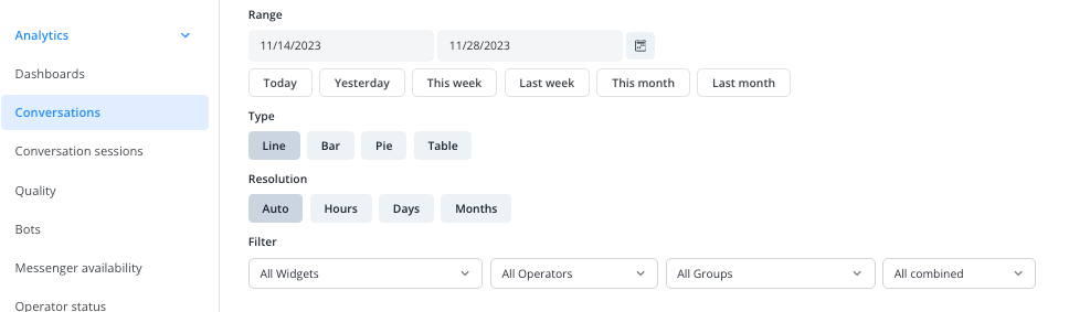
Filters and resolution settings
You can filter each KPI’s data by date range, Widget, operator, and group. This way you define which part of the collected data will be displayed.
With the resolution options Hours, Days and Months you can switch between more detail and more overview in how the data is displayed. If you choose Auto, the resolution is automatically set based on your selected date range. For example, a date range set to Today, would result in the data on an hourly basis for that day.
Also, choose between four different styles to visualize your data: line graph, bar graph, pie chart and table chart. To export your selection as a CSV file, hit Download just above a KPI’s chart.
Resolution limitations:
Since not every resolution makes sense for every date range, we automatically adjust those that don’t offer a useful visualization.
For example, if you select a date range of a year and a resolution of Hours, the result would not be very insightful on any common screen. Therefore, our system automatically switches to a resolution of Months.
The automatic adjustment follows this schema:
- Date ranges larger than 7 days default to a resolution of Days
- Date ranges larger than 62 days (ca. 2 months) default to a resolution of Months
- Date ranges larger than 5 years default to a resolution of Years
Notes:
- If you’re using bot operators (available from our Corporate plan), you’ll find their statistics in the designated Chatbots section. All filter options and data points are differentiated between human and bot operators.
- A conversation is considered started only once a first message has been sent.